Post by David ChisnallI had all sorts of problems explaining to novice users
back in the windows 3.x days that they couldn't use the disabled scroll
bars, and that there really was nothing hidden beyond their view.
It seems that your complaint about disabled scrollers is that they may
mislead users into thinking that they are enabled. However, this
argument extends to *all* disabled controls. There *are* going to be
disabled controls elsewhere in the interface, and removing disabled
scrollers does nothing to address these.
The proper solution to your objection is to make all disabled controls
look less like enabled controls. This is why I suggested making the
disabled scroller (and all other disabled controls) darker than
enabled controls, in addition to removing the bevel.
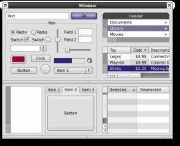
Post by David ChisnallWhen something is scrollable, it should have scroll bars. When it is
not, it should not. To add disabled scroll bars is confusing and
inconsistent (unless you are going to put disabled scroll bars around
the entire window and any another canvas that can't be scrolled).
Disabled scrollers indicate a property of the view: that it will
scroll if necessary (i.e. content gets added to the view or the view
gets resized). Not all controls have this property.
Post by David ChisnallBy all means, keep the trough for them to prevent other UI elements moving
mysteriously, but do not put disabled buttons on a user interface as
anything other than a last resort.
That would be inconsistent use of a trough. Troughs can be clicked,
and indicate an area of travel for a scroll handle or slider. None of
these apply.
Also, the trough solution does nothing to address the scenario that I
described in my previous email on the subject. For convenience, and
since it is on another thread, I include it below:
1. What happens to the arrow buttons when the scroll handle reaches
one end of the track? For example, when the scroll handle in a
horizontal scroller reaches the left side of the track, does the left
arrow button get disabled, considering that it no longer does
anything?
- If it stays the same, it will mislead the user into thinking that it
can be clicked, and something will happen.
- If it disappears, the right arrow button would move to the left, and
active controls that automatically move around on the user are very
bad. (I don't think I need to go into all the reasons here.)
I can see only one alternative: to disable the left scroll button.
2. When the window is enlarged a bit, the scroll handle gets bigger.
If it ends up bumping against one end of the track, the corresponding
arrow button would become disabled (assuming that my first conclusion
above is correct).
3. When the window is enlarged enough, the scroll handle would
eventually get large enough that it bumps up against both sides of the
track, taking up the full length of the track. It then makes sense
that:
a. Both arrow buttons are disabled (again, assuming correct logic above);
b. The scroll handle is disabled (because it can no longer be dragged,
being the full length of the track).
In other words, the disabled scroller would consist of (a) disabled
arrow buttons, and (b) a disabled scroll handle. In the current
mockup, that would simply mean modifying the colour of the
non-arrow-button part to be the same as the arrow buttons.
Is there a hole in this logic?