Jesse Ross
2005-03-20 00:31:42 UTC
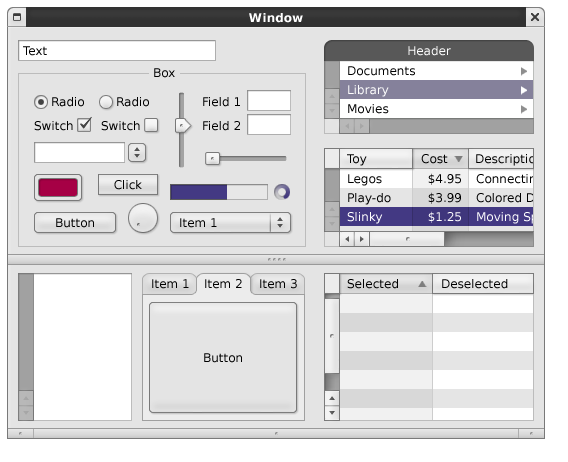
I figured I'd let you guys see this first -- we can battle the default
button in a bit.
http://www.jesseross.com/clients/gnustep/ui/concepts/18/
camaelon_nesedah.png
or
http://www.jesseross.com/clients/gnustep/ui/concepts/
I think this solves the scroller issue -- it should both please the
masses and give an additional indicator that there could be a scroll
bar there.
The colors are all the same now (except for the unfocused selection,
which is a lighter shade) -- I just used the original purple because
I've been falling back on that as the default. We can have a battle
about colors in another thread (email coming soon!).
J.